|
Record Overview
|   |
|
Record Overview
| |
Product options actually have 2 types of records that control them. Both are discussed below.
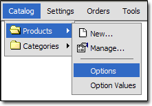
Product Options
To view your product options, click this link:
Here is an overview of the Product Option record:
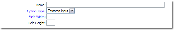
Name
- The name of the option, such as "Size" or "Color"
Option Type
- Controls the way the option will appear to the customer. See the "Option Types" topic for a more detailed explanation of this field.
Field Width
- Controls the width of the option field, if Option Type is set to "Text Input" or "Textarea Input"
Field Height
- Controls the height of the option field, if Option Type is set to "Textarea Input"
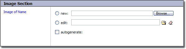
Image of Name
- If an image is added here, it will appear at the top of the option detail popup window.
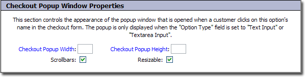
Checkout Popup Width
- Controls the width of the popup window that appears when a customer clicks on an option's name in the checkout form. This only applies when the "Option Type" is set to "Text Input" or "Textarea Input"
Checkout Popup Height
- Controls the height of the popup window that appears when a customer clicks on an option's name in the checkout form. This only applies when the "Option Type" is set to "Text Input" or "Textarea Input"
Scrollbars
- Controls whether or not scrollbars will appear in the popup window that appears when a customer clicks on an option's name in the checkout form. This only applies when the "Option Type" is set to "Text Input" or "Textarea Input". Checking this box will allow scrollbars, unchecking will not.
Resizable
- Controls whether or not the popup window that appears when a customer clicks on an option's name in the checkout form is resizable. This only applies when the "Option Type" is set to "Text Input" or "Textarea Input". Checking this box will allow scrollbars, unchecking will not.
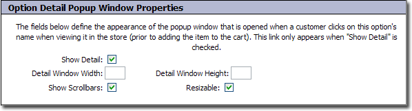
Show Detail
- When checked, the option can be clicked in your storefront when viewing a product. A popup window will open, showing the option values in more detail.
Detail Window Width
- This controls the width of the popup window that is opened when the option is clicked.
Detail Window Height
- This controls the height of the popup window that is opened when the option is clicked.
Show Scrollbars
- This controls whether or not scrollbars will be enabled on the popup window that is opened when the option is clicked. When checked, scrollbars will be present.
Resizable
- This controls whether the popup window that is opened when the option is clicked will be resizable. When checked, the window will be resizable.
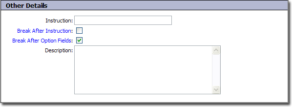
Instruction
- This is the message that the customer will see before the option, such as "Choose Color" or "Specify Size".
Break After Instruction
- When checked, a line break will be inserted after the instruction, before the actual option field.
Break After Option Fields
- When checked, a line break will be inserted after the option field itself.
Description
- A description of the option.
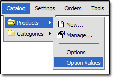
Product Option Values
To view your product option values, click this link:
Here is an overview of the Product Option Value record:
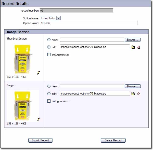
Option Name
- The name of the option that this value corresponds to.
Option Value
- The value of this option. This is the choice the customer will see, not a monetary value. For example, "Red" or "Blue".
Thumbnail Image
- This is the thumbnail image associated with the value. It can be used on the option detail popup to display an image of the option.
Image
- This is the image associated with the value. It can be used on the option detail popup to display an image of the option.