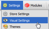
The Visual Settings page is used to control certain aspects of your storefront.
Opening the Visual Settings Page
- Open the control panel
- Click the Visual Settings menu link
Overview
General Settings
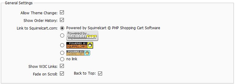
Allow Theme Change
When this field is checked, your customers can change the theme for their account only, using the theme drop down in "Account Options". If you wish to disable this functionality, uncheck this field.
Show Order History
This field controls whether or not customers will see the "Order History" link in the account options after they login. If you check this box, they will see the link. If you uncheck it, they will not.
Link to Squirrelcart.com
This field controls the appearance of the link back to Squirrelcart.com at the bottom of your cart page. You can remove that link by selecting no link
Show W3C Links
W3C links are added to the bottom of your storefront page by default:
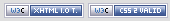
They are used to indicate that your website complies with the XHTML 1.0 Transitional and CSS 2.1 web standards. They can be clicked to validate your XHTML and CSS. If you would like to remove these links, uncheck the Show W3C Links field.
Fade on Scroll
When enabled, elements in the store will fade into view as the page is scrolled down.
Back to Top
This adds a "back to top" button to the bottom right hand corner of long pages:
The button automatically appears as needed, and when clicked takes the user back to the top of the page.
Products (General)
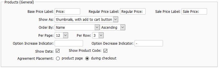
Base Price Label
This value should be text or HTML that you want to display before the base price of an item in the cart, when it is not on sale.
Regular Price Label
This value should be text or HTML that you want to display before the regular price of an item in the cart. This is usually shown crossed out, and above a product's "sale price".
Sale Price Label
This value should be text or HTML that you want to display before the price of a discounted item in the cart.
Show As
This field controls how products will appear by default when a category is clicked. The setting can be overridden at the category record level.
Order By
This is used to specify the field that will be used to sort the products for display when clicking on a category link. This can be overridden on the Category record.
Per Page
This determines the number of products that will be shown per page in the storefront. This can be overriden on the Category record.
Per Row
This determines how many products will be shown per row in the storefront. This can be overriden on the Category record.
Option Increase Indicator:
When a product option increases the base price of a product, the contents of this field precede the price shown for that option. If you wish to use this, you could enter "+" or "add" in this field.
Option Decrease Indicator:
When a product option decreases the base price of a product, the contents of this field precede the price shown for that option. If you wish to use this, you could enter "-" or "subtract" in this field.
Show Data
This controls whether the Product Data section will appear on your product detail pages. By default, this section will appear under Additional Information, whenever at least one product data field is specified on a product record. Product Data includes fields like SKU, Product Code, Condition, Model No., etc....
Show Product Code
When checked, the product code will appear near the product name in the storefront, during checkout, and in order detail views (emails, order history).
Agreement Placement
This controls where sales agreements assigned to products will appear.
Products (New)
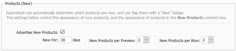
Advertise New Products
When checked, new products will be shown as "new" in your storefront.
New For
This field is used to specify the number of days to consider a product New.
New Products per Preview
This field controls how many products will be displayed in the "New Products Preview" section of your homepage.
New Products per Row
This field controls how many products per row are displayed in the "New Products Preview" section of your homepage.
Products (Preview)
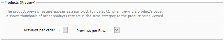
Previews per Page
If you are using the product preview feature, set this number to the number of items you would like to have displayed in the product preview. This is the navigation that is displayed by default to the right of a product's detailed description, and lists links and thumbnails for other products in the category, for easier navigation.
Previews per Row
This controls the number of products seen per row in the category preview navigation block.
Products (Also Ordered)
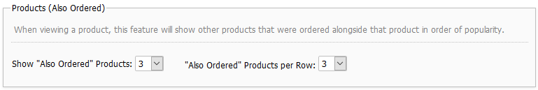
Show "Also Ordered" Products
This controls how many products will appear in the "Customers Who Ordered This Item Also Ordered" section of your product pages.
"Also Ordered" Products per Row
This controls how many products appear per row in the same section.
Products (Related)
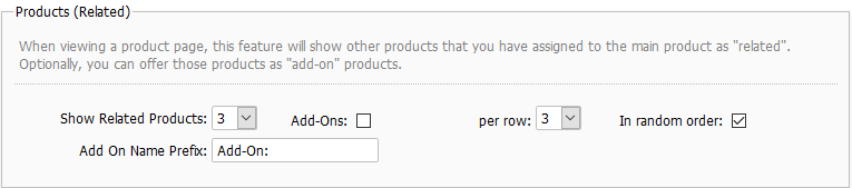
Show Related Products
This controls how many products will appear in the "Related Products" section of your product pages.
Add-Ons
When checked, the related products will appear as add-on products, with options to add them to the cart.
Per row
This controls how many products appear per row in the same section.
In random order
When checked the products will appear in order.
Categories & Subcategories
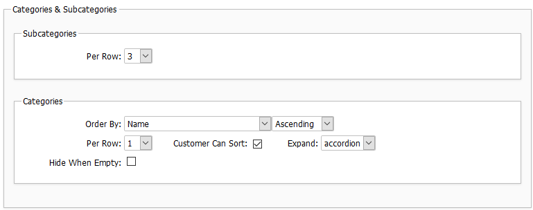
Subcategories
Per Row
This controls how many subcategories appear per row when viewing the parent category.
Categories
Order By
This is used to specify the field that will be used to sort the categories for display.
Per Row
This field controls how many top level categories will be shown per row in the Product Catalog content area of your storefront page.
Customers Can Sort
Checking this field allows customers to sort products when viewing a category that has 3 or more products.
Expand
This field controls when (or if) parent categories in the Product Catalog navigation are expanded to show the subcategories beneath them. This section appears to the left of the page by default.
The default setting for this field is 'accordion'. The settings work as follows:
Accordion - this displays all parent categories in a collapsed fashion. Clicking on a parent displays children below without having to reload the page.
On click - similar to above, but each click requires a new page load.
Always - categories are always shown expanded.
Never - categories do not appear expanded in navigation, even when clicked.
Hide When Empty
When checked, empty categories won't appear in the storefront.
Search
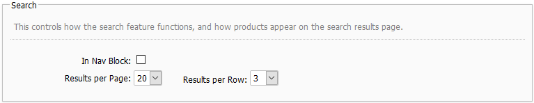
In Nav Block
By default the search feature appears in your header. On small screens it appears at the top of the mobile navigation. Checking this field will make the search field also appear inside the Product Catalog nav block.
Results per Page
This is the default value for number of products to show on a single page of search results.
Results per Row
This controls the number of products seen per row in search results.
Breadcrumb Navigation
Breadcrumb navigation gives you a way to follow your path back through previous pages.
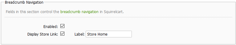
Enabled
This enables/disables breadcrumb navigation.
Display Store Link
When checked, the first link in your breadcrumb navigtion will be to your store's home page.
Label
When Display Store Link is checked, this controls what label will be used for the link to your store's home page.
Cart Preview
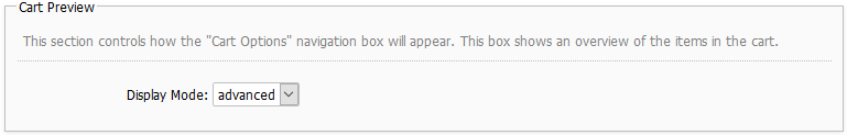
Display Mode
This field controls what will appear in the "Cart Options" navigation box.
If set to "simple", a message will appear to indicate how many items are in the cart, and the total.
If set to "advanced", a breakdown of the items in the cart will appear, with links to change the items.
Checkout
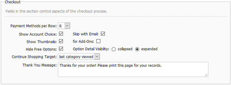
Payment Methods per Row
This field controls how many payment method icons will appear in each row.
Show Account Choice
This field controls whether or not the account choice page is shown during checkout. This page offers the customer 3 choices:
- New Account
- Existing Account
- Skip Account (not shown when "Force User Creation" is on)
Skip with Email
When enabled, the "Skip Account" option on the account choice page will include an email field for the customer to enter their email address. This gathers the email address sooner in the checkout process. This is useful if the user decides to not complete their order as you will have a better chance of being able to contact them.
Show Thumbnails
When enabled, product thumbnails will appear in the cart table.
Hide Free Options
Checking this field causes options that have no cost to not show up in the price breakdown during checkout.
Option Detail Visibility
This controls the default visibility for the option detail section on line items in the checkout, order detail, and HTML order emails.
Continue Shopping Target
This field controls what happens when the Continue Shopping button is clicked.
Thank You Message
This message appears on the thank you page after a customer places an order
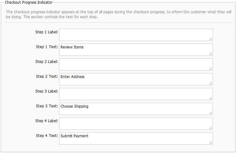
Checkout Progress Indicator
Tooltip
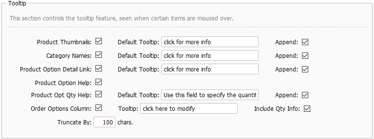
These settings control how the tooltip feature works. For help, most over each field name in the control panel.
© 2001-2017 Lighthouse Development. All Rights Reserved.